Reviews
The Brooklyn Rail — September 2021Art 511 Mag — October 2020
Tussle — May 2020
Portland Press Herald — February 2017
Art Ltd — July 2012, pg.24
Sacramento Bee — April 2012
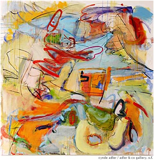
Bold and Beautiful - Gina Werfel's abstractions invite comparisons with de Kooning
by Victoria Dalkey, Bee Art Correspondent
Gina Werfel's abstractions at Alex Bult Gallery prompt comparisons with the works of abstract expressionists Willem de Kooning and Joan Mitchell. These joyfully exuberant paintings manage to be both gutsy and lovely, especially "Homage," which is an homage to de Kooning's painting "Pink Angels."
The exhibition begins with "Mirage," a small work in delicate, springlike tones that set up a witty play of color, light and movement. Next to it is "Battle," a bold, gestural abstraction in which aggressive shades of orange and green contend with subtler blues in a hard-won composition that has landscape underpinnings.
Werfel's paintings set up a dialogue between abstraction and representation, though the paintings in this show are at times wholly abstract as in "Remnants," a burst of mark-making with angular and cursive lines dancing across the surface of the canvas.
At times, one can detect impressionistic elements in her works, as in "Hidden" and "Morning Fog," a pair of small paintings that reflect the weather. Similarly, the larger "Faded Light," with its diaphanous veils of color and tensile lines, calls up a sense of waning or hidden sunshine.
Next to it is the vibrant, richly colored "Winter Conversation," which has submerged figurative eleme nts engaged in a dialogue with each other. This is the densest and most vigorous painting in the show, one that seems to be action painting at its best.
Yet Werfel says that she is not an action painter, since she works back into her paintings numerous times and often uses external sources to initiate and modify her images. Such a source is very evident in "Corciano," based on a plein-air drawing she did of an Italian town where she was teaching a summer-abroad course for the University of California, Davis, where she is a member of the art faculty.
Also informed by landscape but not beholden to it is "E Street," with its jazzy markings and a kind of dancing window in bright orange. It is derived from the street on which Werfel has her studio but only the window remains as a quasi-literal marker.
Werfel compares her paintings to music and dance, which play a part in the inspiration for her works. Other sources are elements in her studio including postcards from Italian and French museums and childhood drawings of knights done by her son. These fragmentary visual impressions float in a fluid space that allows for much invention. Erasures and pentimenti form a kind of record of the process by which the paintings are made.
The most purely abstract works in the show are a series of small paintings in acrylic and mixed media on paper which Werfel says are "not based on anything other than color, form and spatial relationships between collage, paint and the white of the paper."
"Mechanical Geometry" is an antic jeu d'esprit reminiscent of works by John Altoon. Also free-spirited is "Dialogue," in which the paint is denser with touches of metallic gold.
Werfel has a delicate, at times almost pretty, sense of color and a lilting attack that gives a lyrical feeling to many of her works. She tempers this tendency towards prettiness in works like "Battle," "Homage," and "Winter Conversation," which have a more visceral feel. All in all, this is a very strong show that rewards extended viewing. The longer you look at these paintings the better they get.
Santa Barbara Independent — February 2012
 Musical Gesturing
by Josef Woodard, News-Press Correspondent
Upon first impression, the gentle spirits of the work by Gina Werfel, now showing at Jane Deering Gallery, imply a certain floating feeling, an avoidance of grounding. But impressions shift with closer scrutiny, and we recognize that the painter's immediately apparent delicacy is at least partially deceptive. Muscles are flexing and gears are turning beneath the becalmed surfaces.
Werfel, a painter of note and an art professor at UC Davis, also creates paintings from a denser, louder place on the spectrum of dynamics in contemporary abstract art, and has had experience dealing with "plein air" landscape painting. But the lighter, representational-free affairs gathered into an alluring exhibition she calls "Polyphonics" at Jane Deering have a sense of graceful rightness, comparable to the art of Joan Mitchell and Helen Frankenthaler (maybe even a mutant combo thereof). In addition to its self-evident charms, the art plays well and hangs compatibly in the compact but open-feeling space of this new Deering gallery.
This show's title accounts for much in terms of what's abuzz in the painter's aesthetic. True to the musical analogy of the exhibition title, polyphonic being the conjoining and intermingling of different and not necessarily "compatible" harmonic structures and colors, Werfel's visual scheme behaves in a similar way.
We get the idea of the musicality of what we're looking at, also aided by the title, in "Symphony," a pastoral invention, at that. The artist also works well in more compact dimensions (chamber music?), with humbly-scaled acrylic pieces, as small as eight-by-six inches. Still, there's no doubt that the larger oil on canvas paintings are the main event here.
Despite the relative calm demeanor and surface "volume" in the art, there is a fair amount of activity and varied gestural riffing going on. That subtle tension and accordance gives the art some of its character. In "Interlude," for example, a particularly pale and milky space, several spare bolder strokes swim and vie for attention.
Alas, the thicket thickens with "Garland," a more tangled collection of brushstrokes and inklings — a dizzy, desultory garland — of colors and gestures. But a surprisingly arid and vaporous zone on the right side of the painting provides a kind of resonating free space to let the whole breathe. A sense of emphasis on the importance of void and solid, and the expressive power of composition also comes through in the cleverly named piece "Wooded Interior."
Another truthful title, so apt as to seemingly loop back around to sly and gentle irony, is "Light and Airy," befitting a painting suggesting lightness of being, verging on weightlessness. That same title might be applied to the artist's body of work as a whole. Light and airy, yes, but with secret deposits of depth, retinal energy and a critical exploratory spirit to complicate things in intriguing ways.
Santa Barbara Independent — February 2012
San Francisco Chronicle — October 2010
San Francisco Chronicle — April 2010
San Francisco Chronicle — February 2009
 Werfel at Adler
by Kenneth Baker
Work such as Outlaw's and what we see in Complicity can set up a craving for the older, more savory uncertainties of painting. The pictures in Northern California painter Gina Werfel's show at Adler & Co. will satisfy it.
A landscape-inspired near-abstraction such as Knights (2008-09) contains a full measure of unbalancing acts, to borrow playwright Richard Foreman's term, but it leaves the eye glad to be awake in its time.
Art in America — November 2007
 Gina Werfel at Prince Street
by Robert Berlind
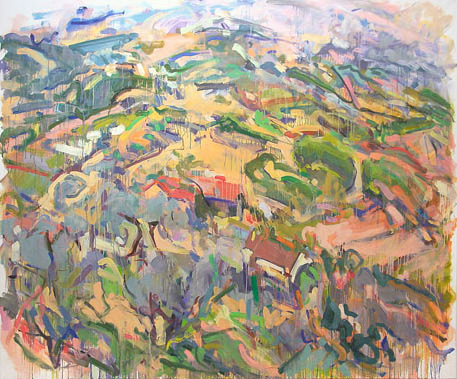
Gina Werfel's paintings, some of them plein-air, move easily between the hill country of northem Califomia and that of Umbria, the similarities of light and terrain more evident, as she paints them, than the differences. In this exhibition. she also traversed the divide between representation and abstraction. She does this not in order to raise theoretical or stylistic questions about painting but to explore continuities and reciprocities between the two approaches.
Her paintings range from a fluid version of Cézannesque spatial structure to gravity-free rococo airiness. The abstractions, which are larger than most of the portability-scaled, on-site paintings, dispense with the topologies of landscape, yet their liquid and loosely calligraphic imagery remains obviously nature-based. The improvisational play of washes and brushstrokes constitutes a sort of unhinging of her fluent descriptive vocabulary, now relieved of its reportorial function. No explicit orientation registers gravity's immutable up and down; in Gaia Diptych, for example, runs of thinly washed paint flow in all directions. The abstractions could be looking to Tiepolo by way of Joan Mitchell.
For the most part, even Werfel's landscapes do not emphasize topical features, although she always establishes a strong sense of place and its picturesque pleasures. Where trees or water or the undulations of hillsides are shown, the movement of the paint is no less emphatic than the image. Her use of diagonals, rather than verticals and horizontals, to establish structural underpinnings favors dynamic flux over architectonic stability. Architectural elements, for example the orange roofs in several paintings, serve to establish scale and precise location. New Construction, in particular, focuses on one of the houses that punctuate the hills west of Davis, where she now lives.
The abstractions could be studio ruminations on the outdoor paintings; the landscapes, in turn, could hardly exist without the tradition of painterly abstraction. In both cases improvisation and chance play central and, one feels, celebratory roles. The 5-by-6-foot Umbrian Landscape, while clearly representational, corresponds to the exhibition's other canvas of the same size, Ground Cover, which is abstract. We seem, in the first, to be looking down from a height toward the foreground, where patches of gray suggest olive trees, moving up to a high horizon. The second offers' no single spatial construct but occasionally asserts roughly parallel, diagonal axes, as though in memory of some particular terrain. An insouciant lightness of touch and a restrained, precisely pitched palette that tends toward a sun-drenched haziness characterize Werfel's work throughout.
Sacramento Bee — May 2005
 Nature Untamed
by Victoria Dalkey, Bee Art Correspondent
Gina Werfel's recent paintings at b. sakata garo carry on an amicable conversation between abstraction and representation, Including both large-scale gestural abstractions and smaller painterly images of the Sacramento Valley. the show offers different points of view about a common subject: landscape.
The abstractions. which have a vertical format, are evocations of color, light and movement which suggest reflections in water, foliage and floral motifs, the essence of landscape without the specific details. The more representational works, which have a horizontal format, employ bold painterly markings to delineate recognizable subject matter, most often scenes of suburban houses in semirural surroundings.
Werfel, who carne to California three years 380 to teach at the University of California, Davis, has exhibited regularly at galleries in New York City and Birmingham, Ala., for many years but is a relative newcomer to the local art scene. Though she has been included in group shows at the John Natsoulas Gallery in Davis, the exhibition of 20 oil paintings at b. sakata garo is her first solo show in Sacramento.
While some of Werfel's smaller works get a bit lost on the gallery's brick walls, the aggressiveness of her energetic mark-making overcomes for the most part a selling that is generally hard on paintings.
While Werfel's earlier landscapes focused on Maine, the Southwest and Yosemite, her new ones examine the clash between nature and man-made structures that occurs as agricultural land is developed. While nature is partially tamed in these images. Werfel's brushwork stays wild, as thick strokes of paint define the elements of the landscape. Up close, the images dissolve into pure painterly markings that assert their individuality, but from afar they read as loosely rendered landscapes that are simultaneously impressionistic and expressionistic.
In these works, Werfel's approach to color ranges from the subtle, grayed tones of “Stonegate Palms" to the brighter hues of “La Playa Drive." The motif of houses and trees facing on a pond with reflections is common to most of these works, which hover on the edge of abstraction. Of them, “Winter Light,” a swirling image of grays and greens, stands out. Also compelling is a wild welter of marks making up an image of palms in evening light.
Wefel's lush and lovely abstractions have affinities with the works of the late abstract expressionist Joan Mitchell. In these large vertical canvases, Werfel's gestural handwriting takes on a lilt and her color seems to cut loose and sing.
The sheer joyful exuberance of painting comes through in these works, which range from the subtle radiance of "Ref1ection" to the tender, springlike, dance of "Movement.” Werfe! clearly bas a romance with paint, but she tempers it with intelligence, control and a discriminating approach to color that keeps works like “Flowers" from lapsing into decorative sweetness.
Art in America — May 2004
 Gina Werfel at Prince Street
by Vincent Katz
Over the past two decades, Gina Werfel has developed a way of painting that tantalizingly walks the line between landscape and abstraction. In recent works from 2002-03, the scale of her marks makes them difficult to interpret as elements of a coherent view. Werfel often uses brushes an inch or more wide, making blunt contours of her subjects. While the scenes may be read from afar, up close the paramount impression is of individual brushstrokes. Even from far away, the marks assert themselves as separate from one another.
In this exhibition, the horizontal canvas tended to be more legible as landscapes, while the verticals functioned more as abstractions. This has partly to do with the fact that the verticals appear to be made at closer vertical points. Whether, as their titles suggest, the vertical views are of a garden an arboretum, a cascade or reflections, they seem to indicate the effects of light on variegated surfaces and colors, while horizontal pieces like Pink House, English Hills and Bone’s Farm (all 2002) makes use of long views that maintain the recognizability of natural and man made structures.
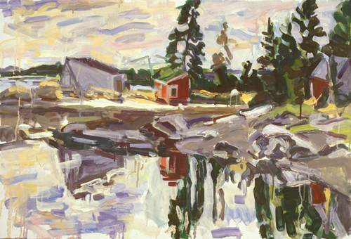
Lobster Pound (2002) is a deft depiction of reflections in water and the forms composing the sides of small dwellings. The viewer simultaneously reading the image as a conventional scene and a disorienting conglomeration of strokes, is placed in a situation that is at once intelligible and unfamiliar. In such works, Werfel’s technique most alluringly captures the particularity of the places she depicts, whether they be in Maine or in the Southwest, two regions in which she has worked over the years.
Werfel’s colors are often muted, and there is much tonal subtlety within her surging strokes. Because her marks can cover broad swaths of depicted areas, she does not need to fuss with intricacies of observed texture and color; the relationships in which she is interested are those within the painting, not the landscape. Her works tend to be in the 2-by-3-foot range; one wonders what would happen to Werfel’s perceptual experiment if she upped the size of her canvases. She might find some surprising results.
Interviews
Alumni Studio Visit — May 2020Painting Perceptions — November 2015
Dime & Honey — October 2015
Huffington Post — November 2013